School-data guide
How to Read the California School Dashboard
Use Status, Change, performance colors, indicators, and student-group results to identify strengths and develop careful professional questions.
Open the Dashboard and find the school
Search for the school or district by name. Confirm that you selected the correct organization and location before interpreting results.
How the performance colors work
The 2025 Dashboard reports Status, the current-year result, and Change, the difference from the prior year. These two dimensions combine to produce a performance color.
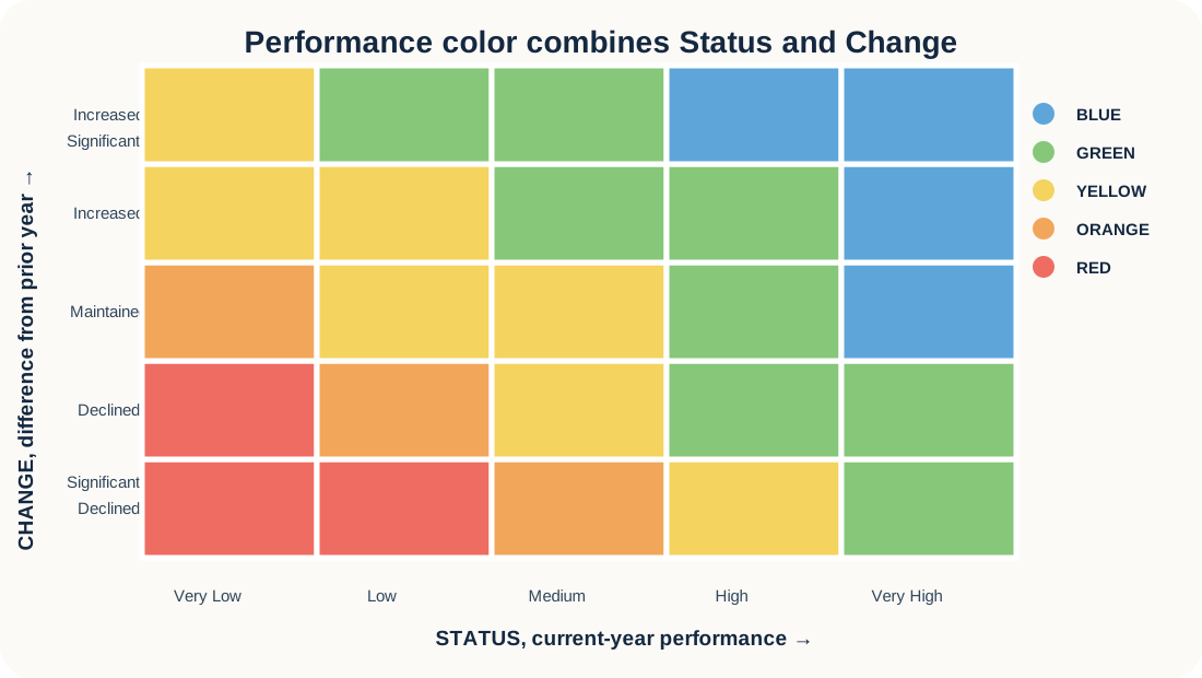
Teaching illustration: the exact cut scores and five-by-five table vary by indicator. Use the official Dashboard details for the selected indicator.
A color is not a grade. It is a summary of current performance and change. Read the numbers and indicator details before drawing conclusions.
Choose more than one indicator
Review indicators relevant to the school and position. Depending on school type and available data, these may include:
- English Language Arts and mathematics
- Chronic absenteeism
- Suspension rate
- Graduation rate
- College/Career Indicator
- English Learner Progress
- Science
- Local indicators reported by the district
Read Status, Change, and color together
| What to record | What it tells you | How to speak about it |
|---|---|---|
| Status | Current-year level or result | “The current result shows…” |
| Change | Movement from the prior year | “Compared with the prior year, the result…” |
| Color | Combined performance level | “The combined performance level is…” |
Examine student-group results
When student-group information is available, look for similarities, differences, and missing data. Do not treat the schoolwide result as the experience of every student.
Identify one strength
Select an indicator supported by the evidence. Name the indicator, Status or current result, Change, performance color when reported, and why it may represent a strength.
Example: “Graduation is a possible area of strength because the school reports a high current rate and improvement from the prior year. I would want to learn which advising and student-support practices contribute to this pattern.”
Identify one pattern to understand better
Use cautious language. The Dashboard can show a pattern, but it usually cannot explain the cause.
Better: “Chronic absenteeism is an area I would like to understand better, particularly the variation among student groups.”
Avoid: “The school does not care whether students attend.”
Turn data into an interview question
Ask about current work, supports, collaboration, or priorities rather than criticizing the school.